Agapé France
Agapé France is a diverse movement of volunteers and missionaries working across student campuses, arts, sports, and digital media. Founded in the early 1970s, the brand needed to evolve to resonate with a new generation while maintaining its unique and expansive mission. The goal was to transform a brand into a unified and flexible system to help workers communicate and connect people wherever they are in their faith in Jesus.
SCOPE
Brand Identity System
Logo Redesign
Brand Architecture
Typeface & Iconography
Motion Graphics
Art Direction
Voice & Tone
Brand Guidelines
Templates & Workshops
Logo Redesign
Brand Architecture
Typeface & Iconography
Motion Graphics
Art Direction
Voice & Tone
Brand Guidelines
Templates & Workshops
The challenge
Our comprehensive audit revealed that the Agapé brand had become fragmented. With dozens of sub-ministries operating independently, the public often struggled to understand all that Agapé does or make connections between its activities. The brand equity was divided. They desired clarity, resources, and to resonate with a younger generation.
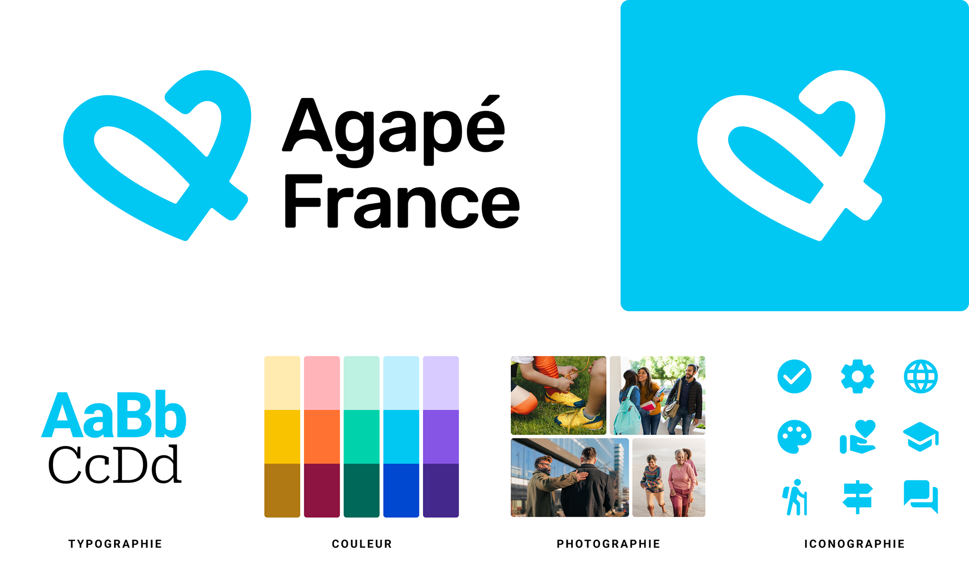
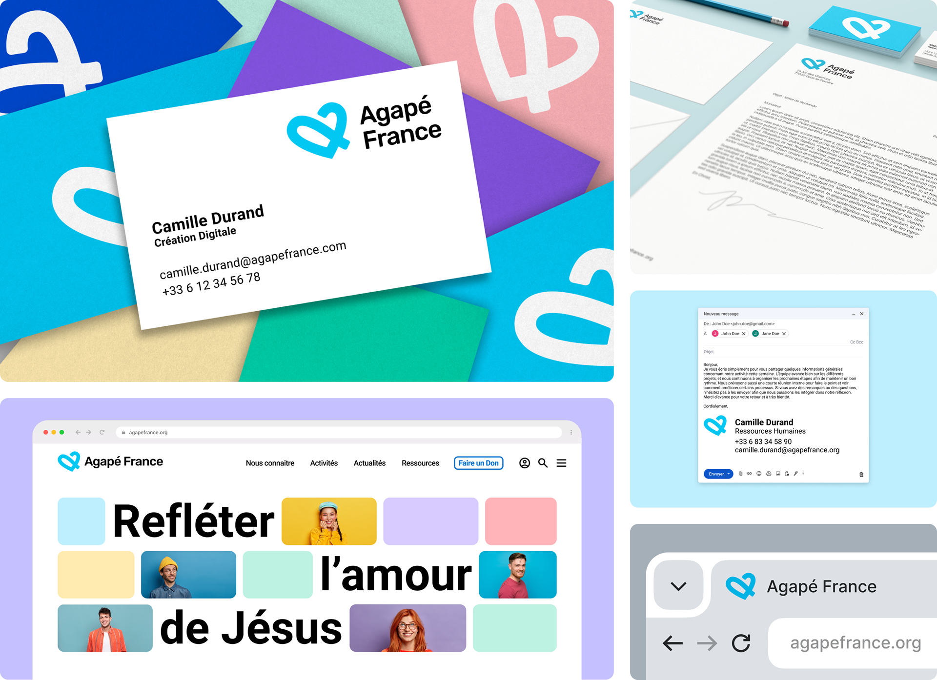
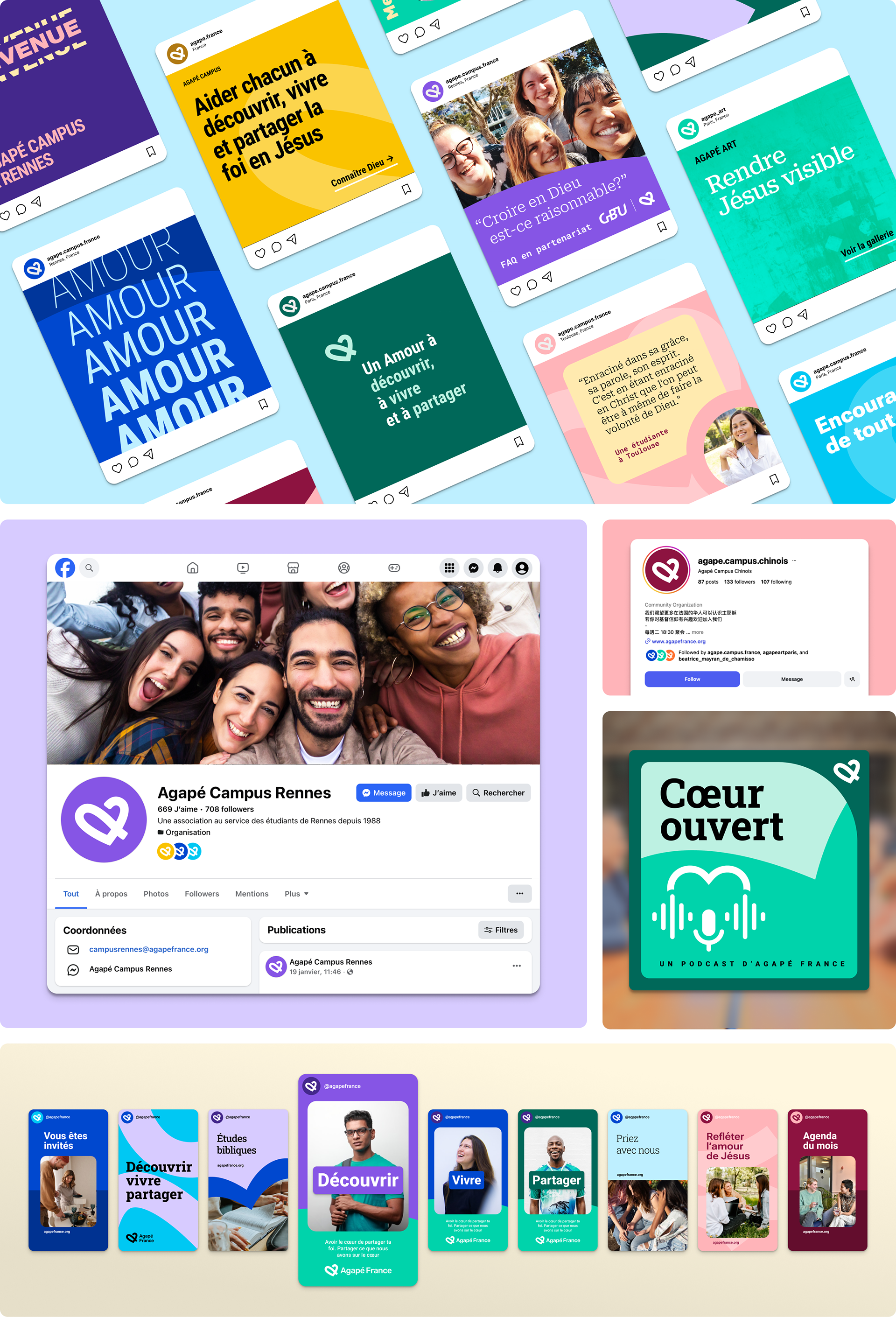
Visual Language
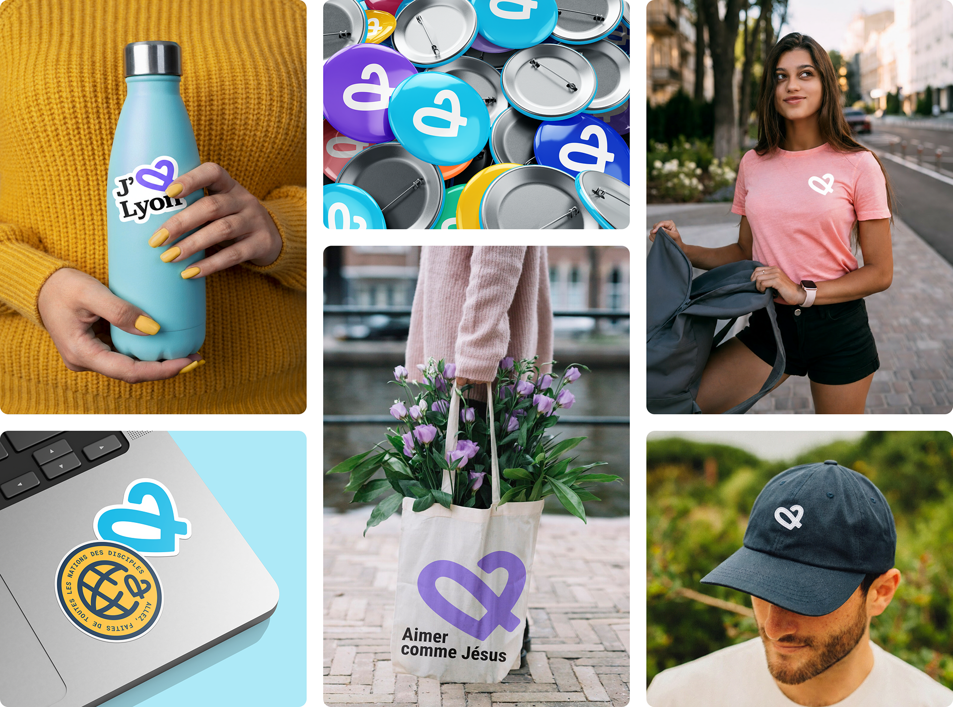
The art direction of the new look is Luminous, Friendly, and United. The heart symbol is set in motion and shows our growth and faith in action. The vibrant blue represents hope and clarity, and it works in both light or dark modes. It's complemented by an expanded palette to help differentiate all their various activities. The photographic style uses natural light, real faces, and movement to evoke warmth and trust. The Roboto font family provides a clean, modern, and legible typography across digital and print touch points. The Google licensed font is free and comes in a serif and other variations for when ministries need a more formal feel.
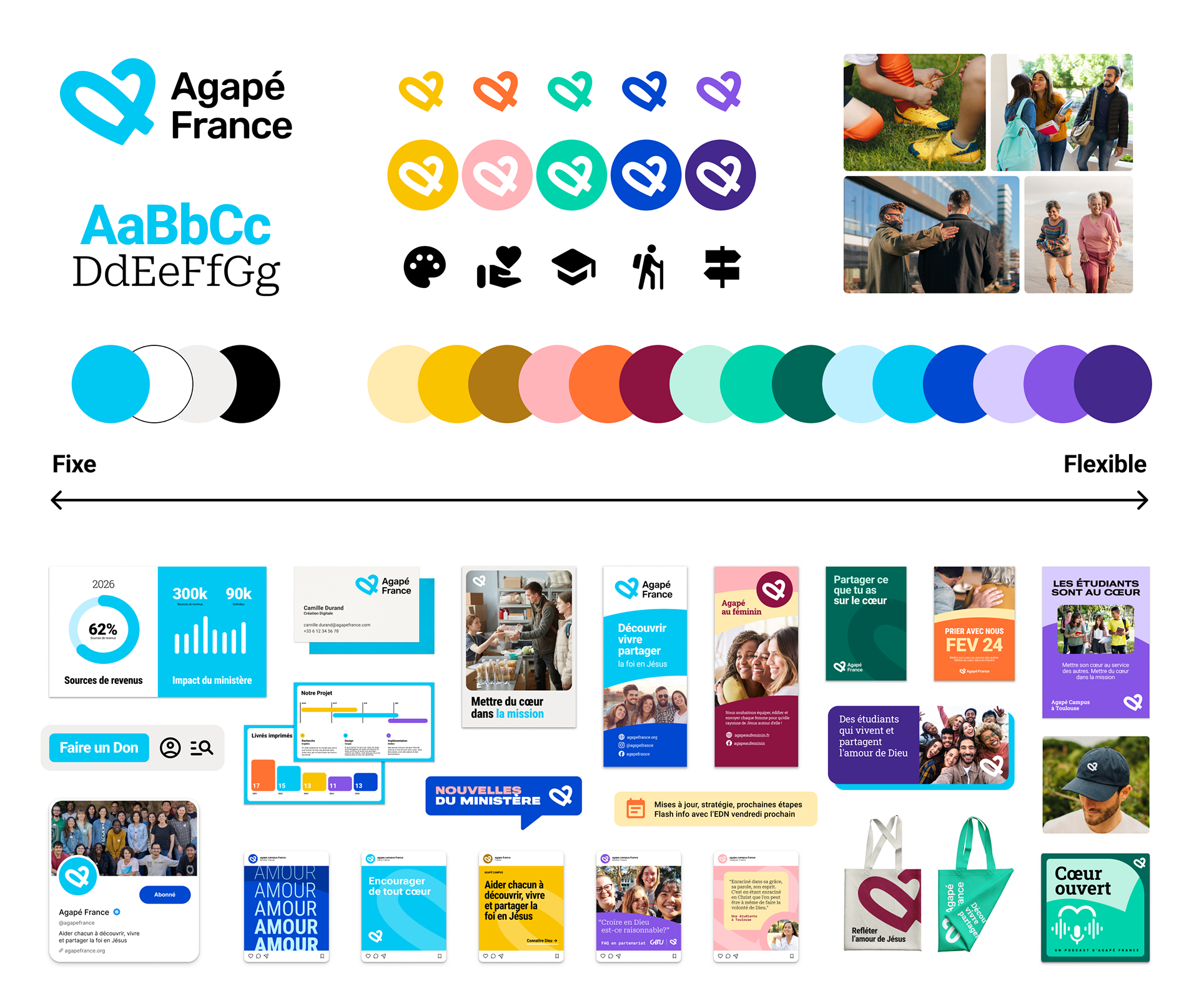
Fixed & Flexible
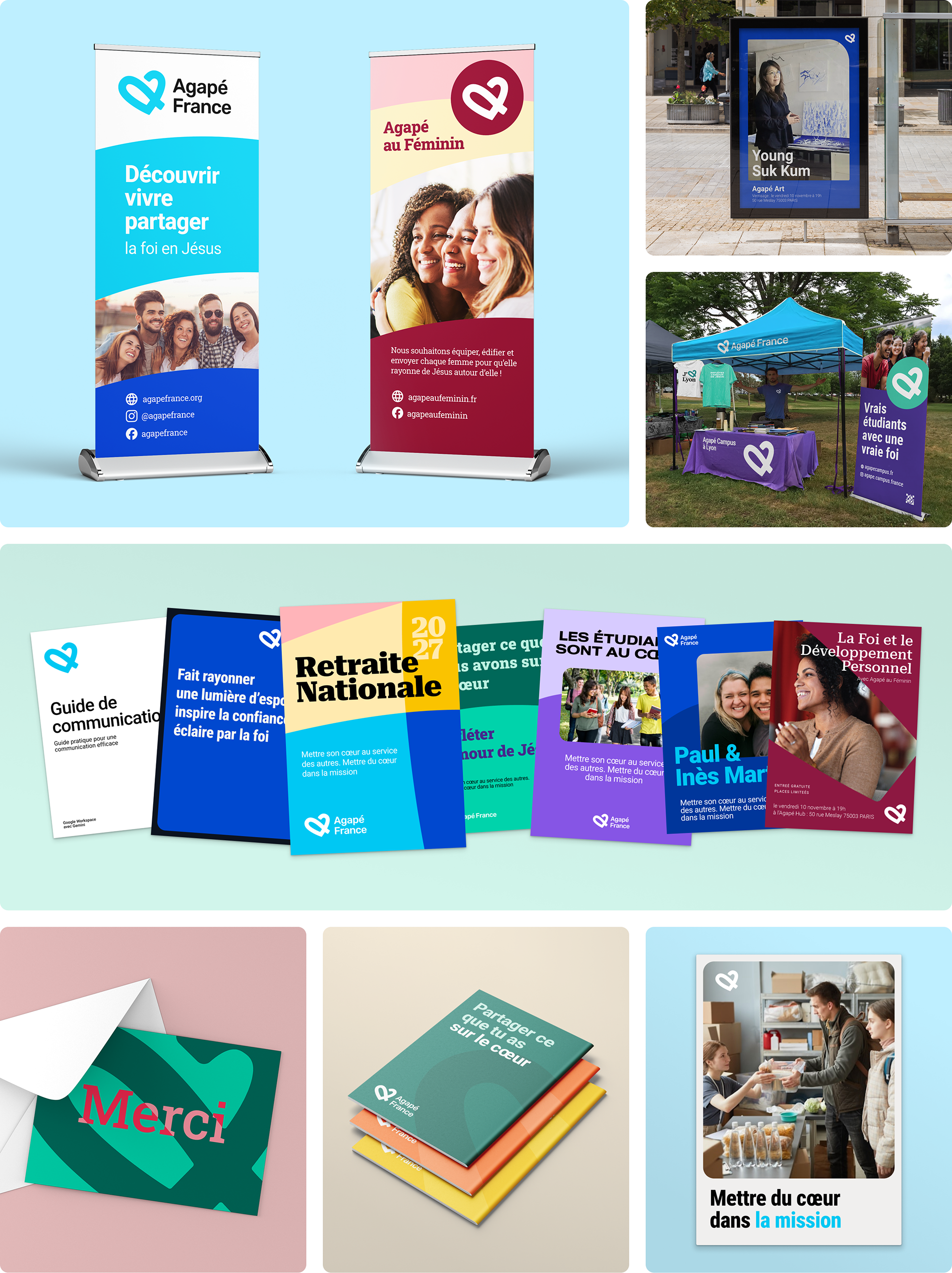
Our strategy was to bring unity and cohesion by adopting a fixed & flexible brand architecture.
Fix: A strong parent brand serves as the foundation, ensuring consistent use of the primary logo, typography, and core mission.
Flex: Ministries like Agapé Campus and Agapé Art can utilize a secondary color palette, flexible graphic elements and photography to tailor their message to specific audiences while staying connected with the parent brand.
A Clear, Authentic Voice
We redefined Agapé’s voice to be wise, welcoming, and authentic. This meant removing overly-religious jargon in favor of clear, direct language that speaks to the heart of the reader. The messaging shifted from "about us" to "for you" approach, inviting seekers and believers alike into a shared movement.
Ready for the Future
The result is a unified, bright, and relevant identity that equips Agapé France for its official 2026 launch. By providing an online brand guide and shared templates, we reduced operational friction and created a cohesive experience that builds long-term credibility and trust for all the ministry's activities.
The launch
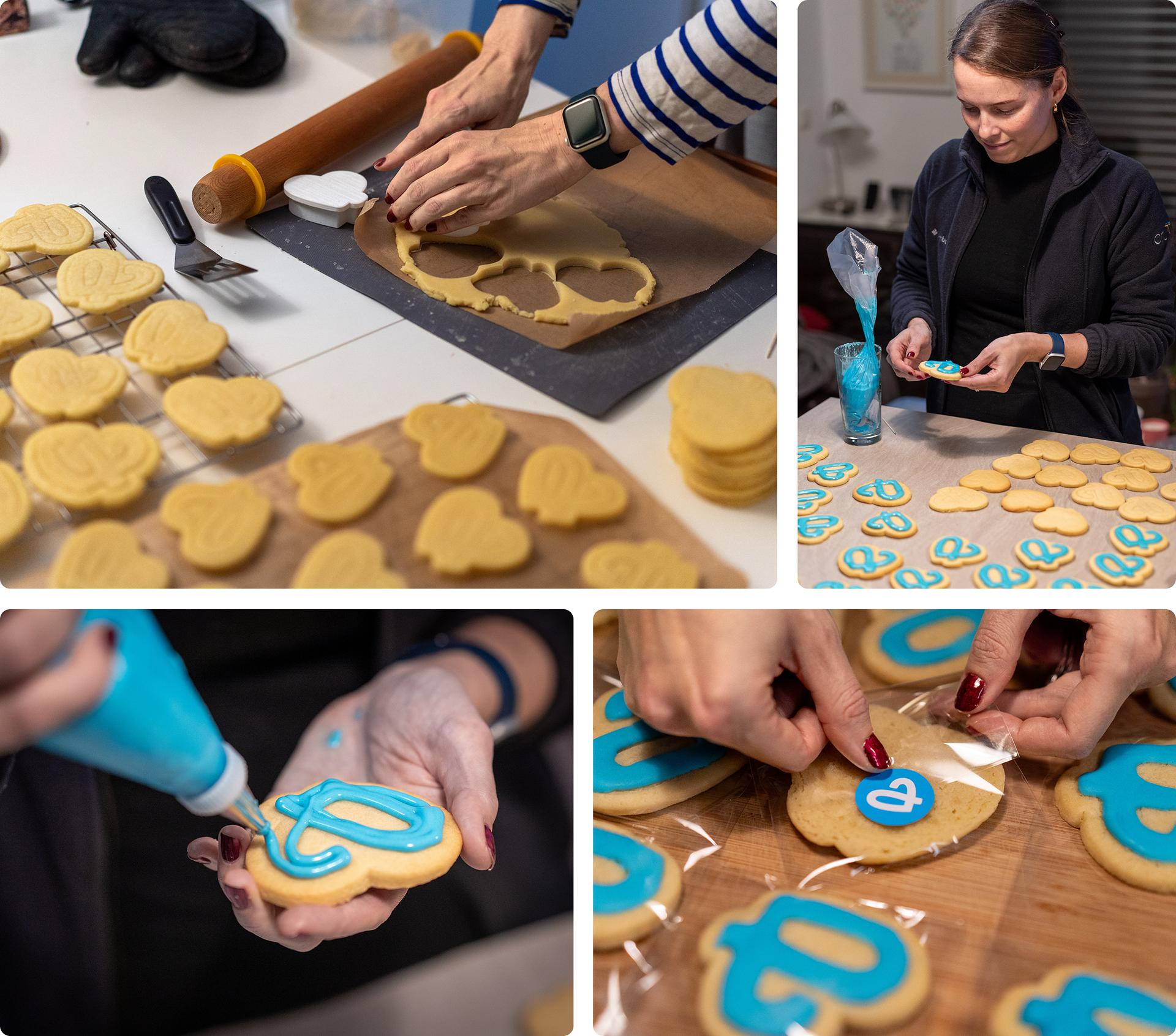
We celebrated the launch at the National Retreat in February. We taped sticker sheets under all the chairs for everyone to find, while the leadership team passed out pens and thermo-mugs with the new branding.
Ann even added a warm touch to the event by baking logo-shaped cookies from a custom 3D printed cookie cutter she designed.